A Meditation on Watercolors: Tips and Techniques for Artists
TL;DR: I admire the daring artists who dive headfirst into the deceptively challenging yet immensely rewarding medium of watercolors. Unlike oils, where you can literally repaint entire portions of the canvas, thereby correcting mistakes until you achieve the intended outcome, with watercolors, you get one bite at the apple, so it’s essential to start with a plan. This blog provides tips and tricks to get you started on your rewarding watercolor journey.
A brief introduction on watercolors.
A proverbial one bite at the apple defines the meditative aspect of watercolors. The immediacy of working in the moment and stumbling upon the inevitable happy accidents as your watercolor painting progresses. The unpredictability of where you end up is what keeps painting in watercolors fresh and exciting. You must work quickly and have a plan. And always keep your brushes clean and your water fresh to maintain vibrant, living colors. Hey, what do you know? There are two tips right there. We’re off to a good start. Here’s some more tips to get you started.
Tip One: Work light to dark.
Depending on the quality and individual hues of your watercolors, as well as the amount of water mixed into them, the pigments will lighten as they dry. Don’t panic. This characteristic is a key advantage of watercolors, allowing for that intrinsically beautiful transparent quality that opaque paints, such as oils, cannot match. Here’s the tip: If you are painting a more detailed subject, such as a human face, let the underpainting dry before layering more color to achieve the intended levels of value and saturation. Depending on the level of detail in these areas, you will also need to control the amount of water to maintain your edges. This method is called wet-on-dry.
***
➡️ Tip within a tip: Remember to plan ahead and reserve the white of the paper for the lightest areas of your composition. Some refer to this as the Golden Rule of Watercolor, for good reason. Once it’s gone, it’s gone. One method for preserving the paper is to apply a liquid masking fluid made for watercolors before starting your painting. I would experiment as there are many products with varying results. My advice: only apply it to dry paper and remove the gummy residue as soon as possible as it tends to fuse with the paper making it difficult to remove if applied too heavily or left on too long. Another less tempermental method is to use a Permanent White gouache to paint back in highlights as the finishing touches to your painting.
***
Another popular watercolor technique is painting wet-on-wet. This looser, more abstract approach yields vibrant blooms of color, which can range from happy accidents to muddy epic fails. It’s called watercolors for a reason, so you might as well take advantage of its fundamental element, water. I’ve seen artists set up their artboards almost vertically so that the watercolors run down the paper, redirecting the dripping brushstrokes to create amazing cascading gradients that evoke a surprising sense of depth. Like a cityscape street scene on a rainy day. Another watercolor effect involves sprinkling salt over the still-wet paint to create cool starburst textures.
***
➡️ Tip within a tip: Texture comprises one of the four elements of watercolors, along with color, shape, and value. Each of these could fill its own blog, so I will leave this for another day.
Tip Two: Sketchbook practice.
Let’s face it, for every frame-worthy masterpiece, you’re due to produce an inordinate amount of cringeworthy messes. This is not only good. It’s essential to learning the craft of watercolors. I recommend acquiring sturdy sketchbooks that can handle at least some amount of water and practicing regularly to develop your skills. Set a schedule if that helps.
Like most artists, I have stacks of sketchbooks that I revisit to see where I was a few years—or decades—back, compared to where I am now. I gotta tell you, this progression is non-linear. I painted watercolors in grade school that I admire as much as some of my recent output.
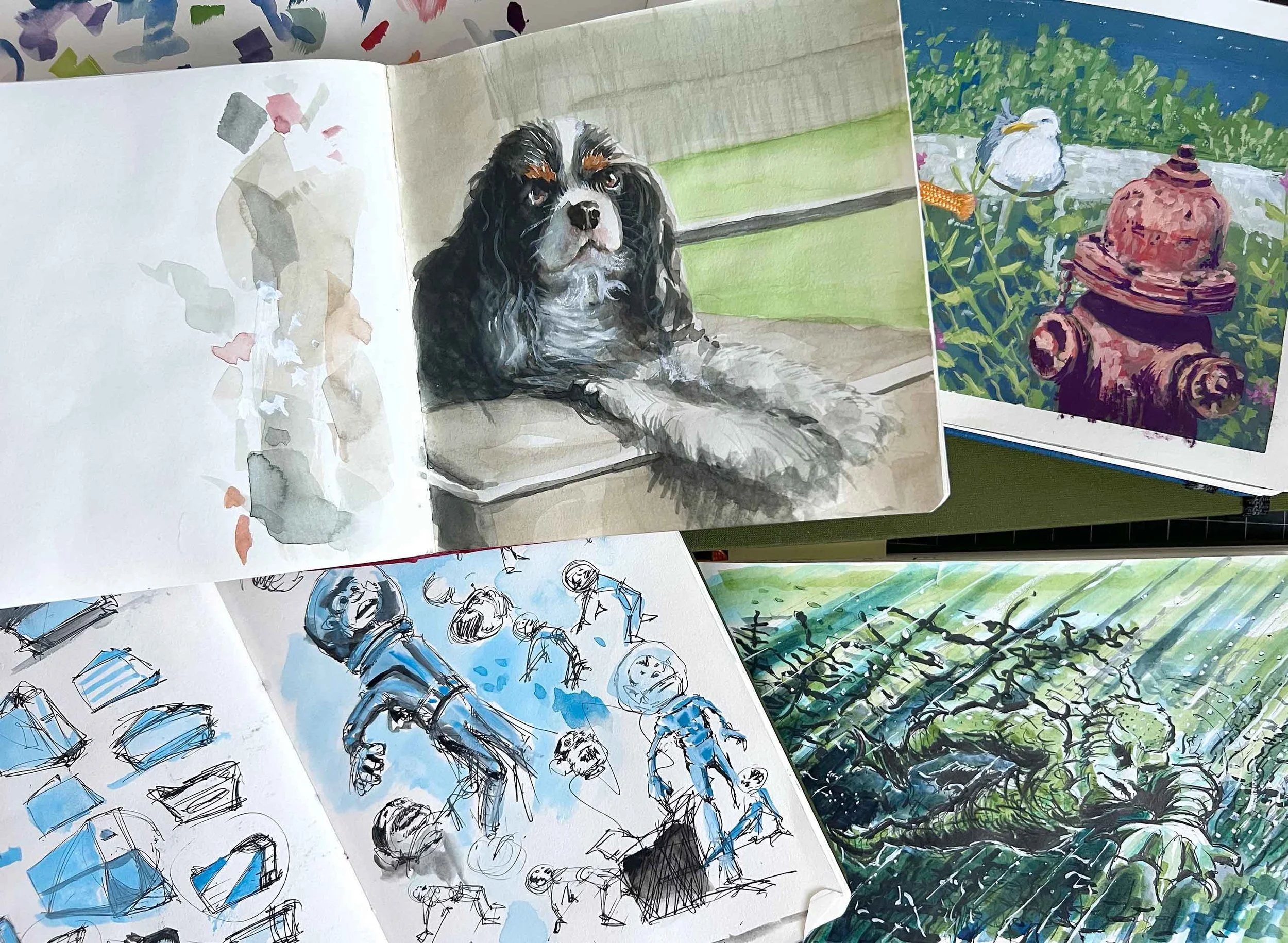
My Sketchbooks
Here’s a collection of my favorite sketchbooks, Handbook Journal Co. by Speedball. It’s a frustrating name, but it is what it is. Each hardbound book contains 128 acid-free, 130 GSM pages which hold ink and light watercolor washes without buckling.
I like to personalize the hardcovers with stickers and ephemera picked up over the years.
Another must is to add a start and finish date for each book.
Now, as for your sketchbook subject matter—when not copying comic strip characters—why not draw inspiration from nature? You can do this from the comfort of your own home, using still-life objects, flower arrangements, or photos from that trip to Yosemite. Or, for the adventurous types, venture outdoors to paint en plein air; it doesn’t really matter. The ubiquity of the natural world means that understanding how to paint the four classical elements of nature will enhance your art.
The classical elements of nature:
Earth: Think igneous, as in rocks, soil, and mountains.
Air: Look up at the sky. Do you see those beautiful clouds floating past on a sea of deep azure blue? Paint that.
Fire: Perhaps a volcanic eruption or an alien spaceship breaching Earth’s atmosphere over Los Angeles. Hey, it could happen.
Water: Sunlight glistening off a mountain stream filled with colorful rainbow trout. Or a sailboat plying cerulean to cobalt-blue waters.
***
➡️ Tip within a tip: Paint with your eyes, not your brain.
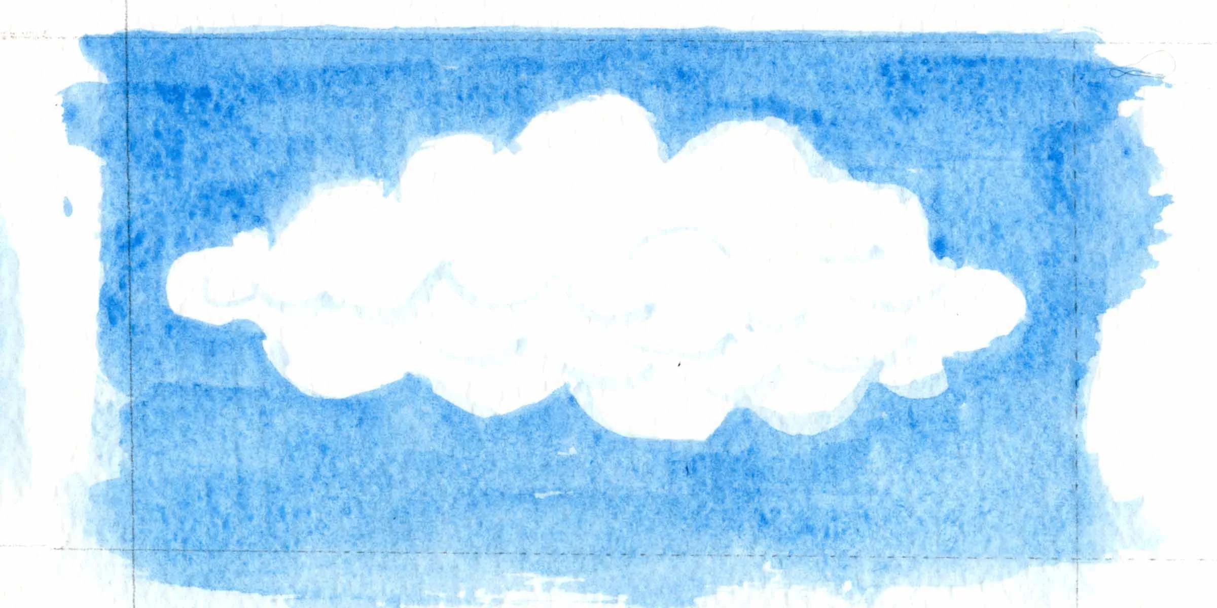
If you let your brain dictate a cloud in the sky, it could look like this.
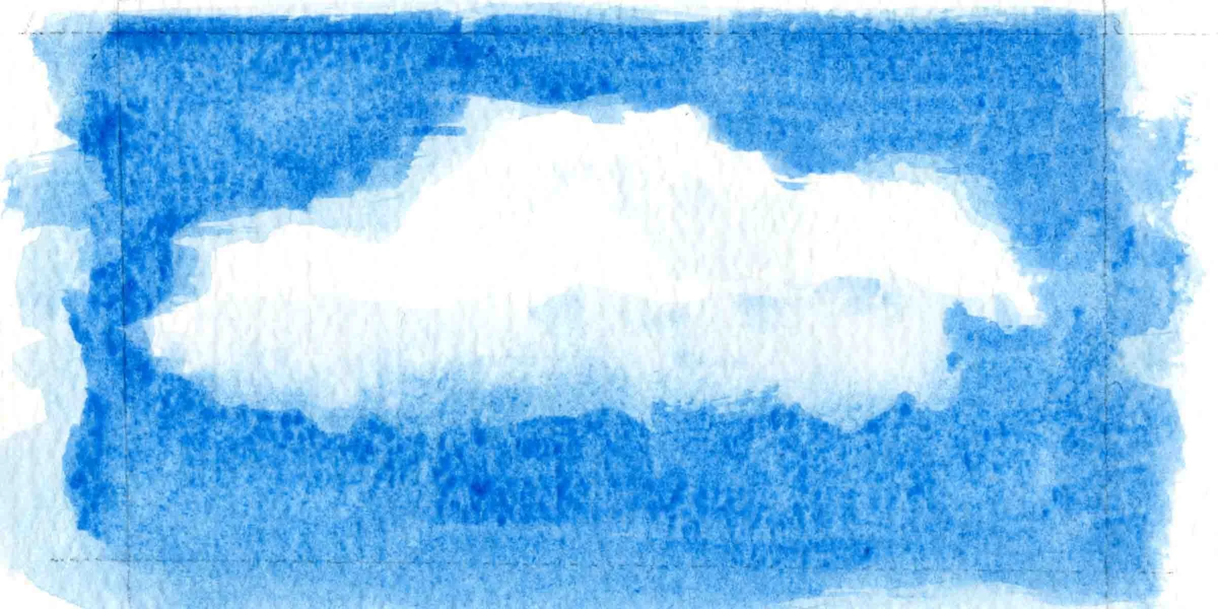
If you paint the cloud as it actually appears, it may look more like this.
Tip Three: Hot, cold, or rough press watercolor paper.
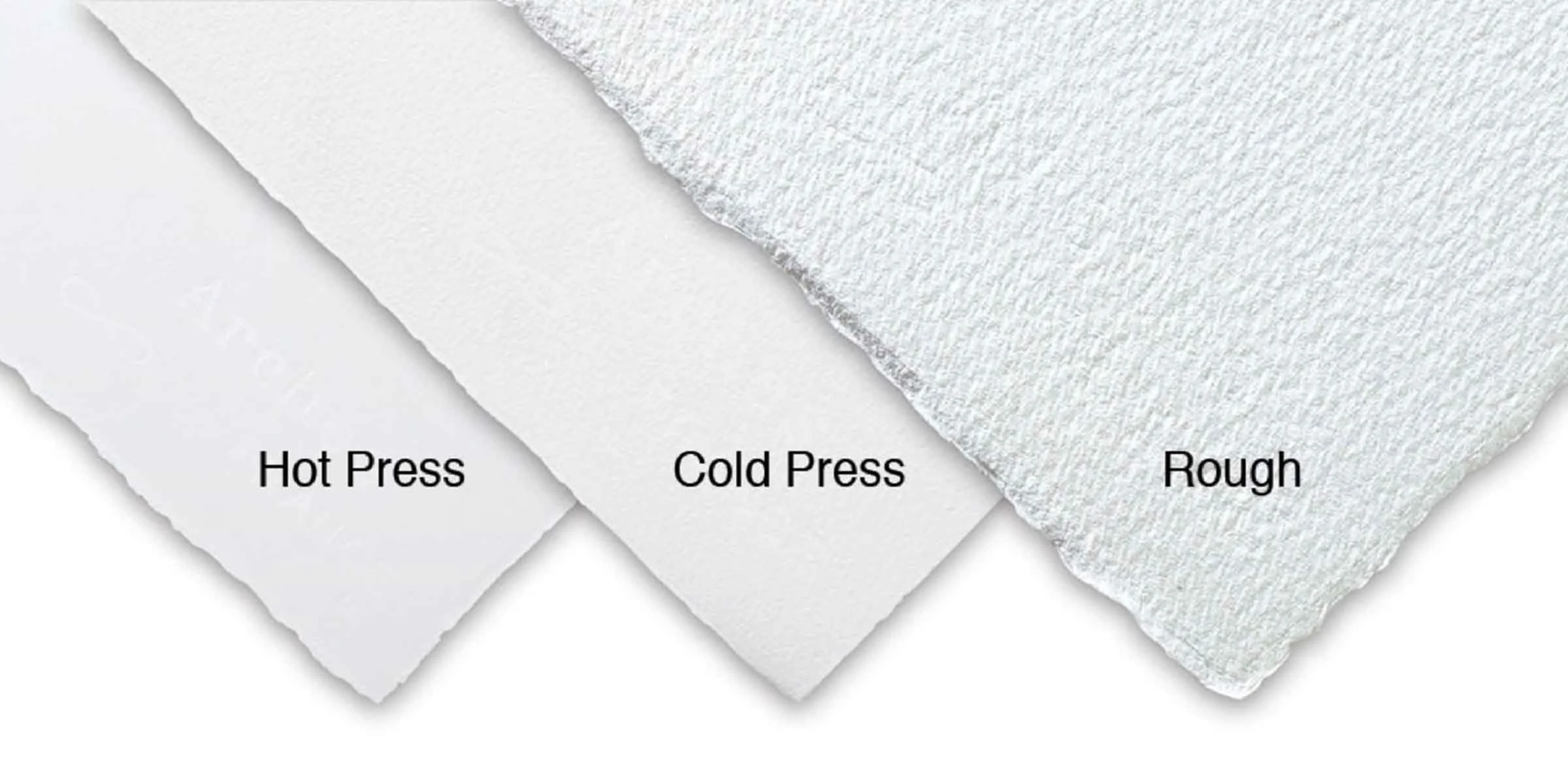
So, what’s the difference between hot, cold, and rough press paper?
Hot press has a smoother finish and is less absorbent, allowing for more detailed illustrative results. Cold press has a prominent watercolor texture of bumps and dimples that the paint absorbs into, better suited for larger paintings with fewer small details. Rough press is the third category, characterized by the heaviest texture, for large, expressive watercolors.
I used the Stonehenge Aqua Hot Press from Legion Paper for the pages in my recent graphic novel, The Wormhole Incident. My review? I highly recommend. First, the paper held the inked lines with almost no spreading, which can be an enormous frustration when trying to draw with pen and ink on inferior-quality paper. By the way, after some trial and error, I have found that Rohrer & Klingner Sketch Ink in Lotte (a deep black ink) is as close to a waterproof ink as you can get to fill a fountain pen, so it works great with watercolors.
So, with the linework completed, and more germane to the subject of this blog, the bright white hot press paper stood up to layers of watercolors (and some gouache) with only minimal bowing. So little, in fact, that after a few spreads, I stopped pre-wetting the paper and taping it down. See below. Instead, I used an old portable blow dryer to speed up the drying time and flatten out the minimal buckling of the rugged paper.
***
➡️ Tip within a tip: Stretching is the process of taping your paper to a flat board and soaking it with a large brush or sponge, and then letting it dry before starting your painting. This preparation can be essential for watercolor paper under 300gsm or 140lb, which tends to buckle. For thicker sheets, it’s less necessary and a matter of personal preference, regardless of the paper.
***
To digress for a moment, I have an affinity for fountain pens when working with watercolors. The fountain pen’s linework appears more fluid and natural with the watercolor brushstrokes—the antithesis of using mechanical ink pens. My weapons of choice are a Pilot Falcon Extra Fine nib and my workhorse, a Pilot Parallel 2.4 mm pen. Both are compatible with Pilot CON-40 fountain pen converters filled with the aforementioned Lotte ink.
Tip Four: Tubes or cubes, which to choose?
Most of us can recall creating art with little plastic tray paint sets containing a row of shallow wells with a selection of primary and secondary colors. On the other hand, growing up and watching my father paint in watercolors, I noticed he used tubed watercolors. So, I viewed tubes as more professional and pan watercolors as more juvenile or amateur.
I have shed this stereotype since developing my comic strip and filling sketchbooks with the cast of Lost Cactus and its desert surroundings, using panned watercolors as a convenient and easy-to-use palette to breathe life into my characters via the vibrant watercolors.
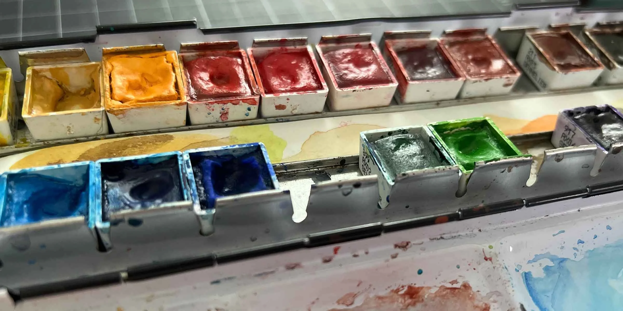
My watercolor sets.
To date, I possess a collection of watercolor pan sets from handcrafted cubes in antique lozenge tins to travel-sized Windsor and Newton paint sets that fit in a pocket. My workhorse set is a palette of interchangeable Sennelier French Artists’ Watercolors. These are the top-of-the-line in my humble opinion. You can also replace individual colors as needed with minimal waste. (Like toothpaste, you can’t put the paint back in the tube.)
***
➡️ Tip within a tip: I don’t use every color under the rainbow; I prefer to mix colors from a more limited palette. It’s how my creative mind operates. Minimal and streamlined, like the medium. So when approaching a project, I will customize the well-built Sennelier metal palette with only the colors I am using. If I were painting from tubes, I wouldn’t open and waste colors that I wasn’t planning to use. Same thought process here. Plus, I am easily distracted and don’t want to see a Dioxazine Purple unless I plan on using it.
***
The pros and cons of watercolor tubes versus cubes.
Watercolor Tubes
Pros:
The ability to have higher concentrations of pigment on your mixing surface is better for larger-scale paintings.
Less cumbersome color mixing.
Cons:
More expensive.
More wasteful.
Less convenient.
Watercolor Cubes
Pros:
Portability and convenience.
Less wasteful.
Easier for beginners.
Cons:
Not suitable for large-scale projects.
Prone to muddiness. (Remember, keep thy brushes clean and water clear.)
Tip Five: A brief on brushes.
Like the Sennelier watercolors and my favorite fountain pens, I have a strong opinion on the best watercolor brushes for the money on the market today. I use the 3950 Series Princeton Velvetouch Synthetic Brushes. The Princeton company offers a brush series for every medium, some of which are more suited explicitly for watercolor. However, because I work in mixed media, the Velvetouch Series is my choice. They are durable and have a comfortable grip. Their best attribute? They hold their shape, unlike cheap brushes that look a mess after a few uses.
Tip Six: Other tools you’ll use.
When setting up your workspace (that makes it sound so boring 😐), have your palette and water within easy reach. Additionally, I prefer to use a high-quality ceramic tray to mix colors. Let’s see. What else. You’ll need a few sheets of paper towels handy. Some artists use sponges. Whatever works. Maybe that tube of white permanent gouache to finish things off and touch up the finished composition. That’s really about it. The point is to have fun and experiment with the watercolors. See where it leads you. And when you’re confident enough, post an image or video of your work on Instagram, and if you’d like, feel free to tag me at @jhartistauthor.
Tip Seven: Copy what you admire.
An excellent way to learn watercolors is by copying, yes, copying, the works of artists you admire. You will discover intrinsic methods that no amount of books, blogs, or videos can offer. Of course, your final result may pale in comparison to the original. That’s okay. These studies are for your personal edification and learning.
As for myself, it’s been a while since I tried to replicate a painting. Once I have a few more recent successes from some of my favorite artists, I’ll feature them in a future blog. Who are my favorites? Due to my commercial art background, I gravitate toward those whose careers have included long or short stints in the field of commercial illustration. Among watercolorists, my favorites include Winslow Homer, as well as modern-day artists such as my late father, Phil Hopkins, James Gurney, of Dinotopia fame, and Bill Watterson. Yes, that Bill Watterson.
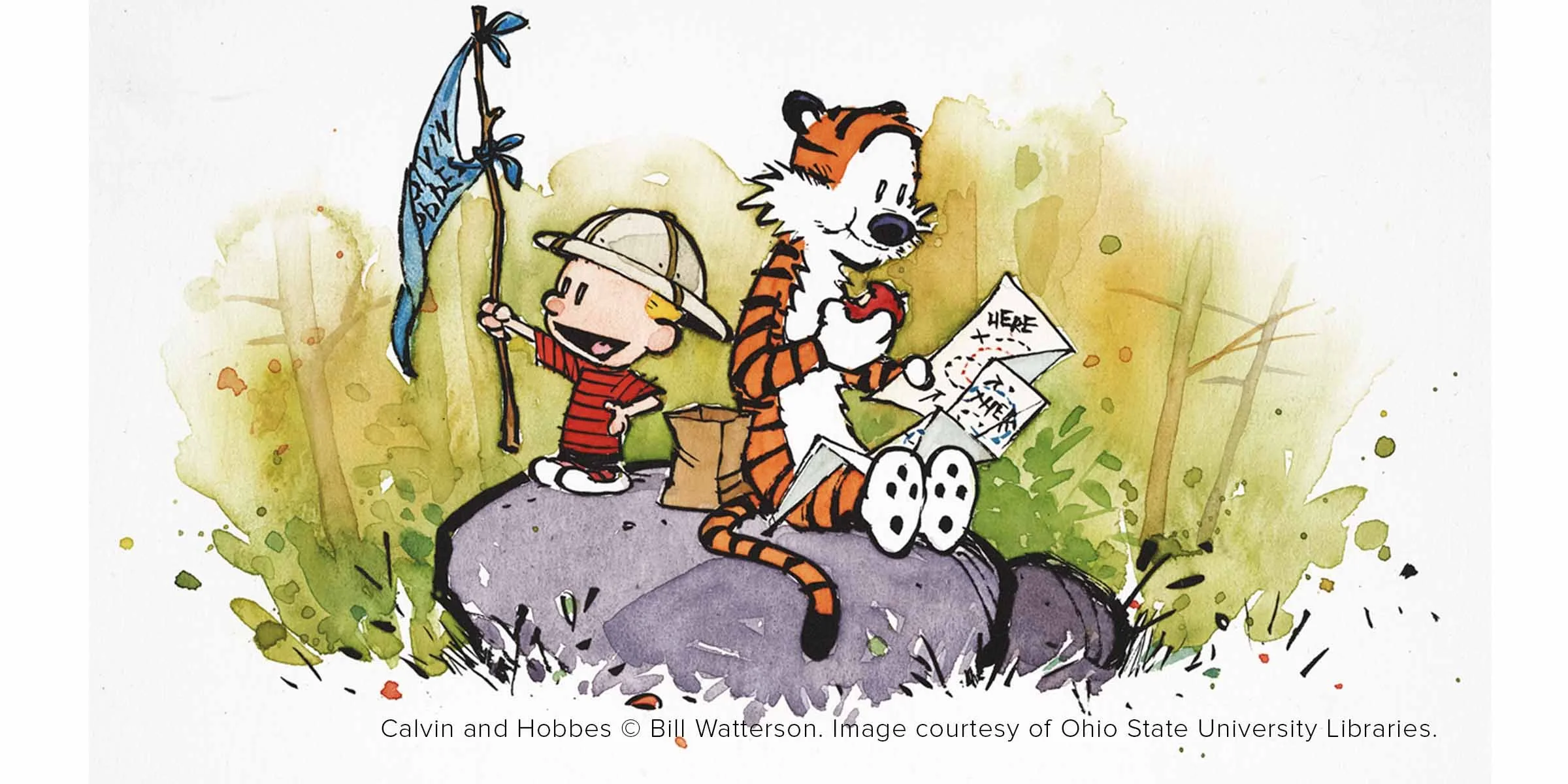
My top artistic influence: Calvin and Hobbes.
Bill Watterson’s Calvin and Hobbes has had a great influence on my art through the years. The comic strip evokes happy memories of ripping open the Sunday paper to the comics section and cutting out the latest Calvin masterpiece before attempting to emulate his wonderfully unique style. Meanwhile, the books and calendars showcased his distinctive mix of inked lines and watercolors brighter than the sun on a warm summer day, effortlessly conveying a sense of place and time, fully immersing the reader in Calvin’s make-believe world. Thus defining the essence of true art—regardless of the medium—evoking an emotional response from the viewer.
Calvin and Hobbes © Bill Watterson. Image courtesy of Ohio State University Libraries.